FluentMint
Partnership offer page where the deal reads as a small table.
A partnership offer: FluentMint builds, hosts and supports software for educators, and the educator keeps 50% of every sale.
Visit fluentmint.com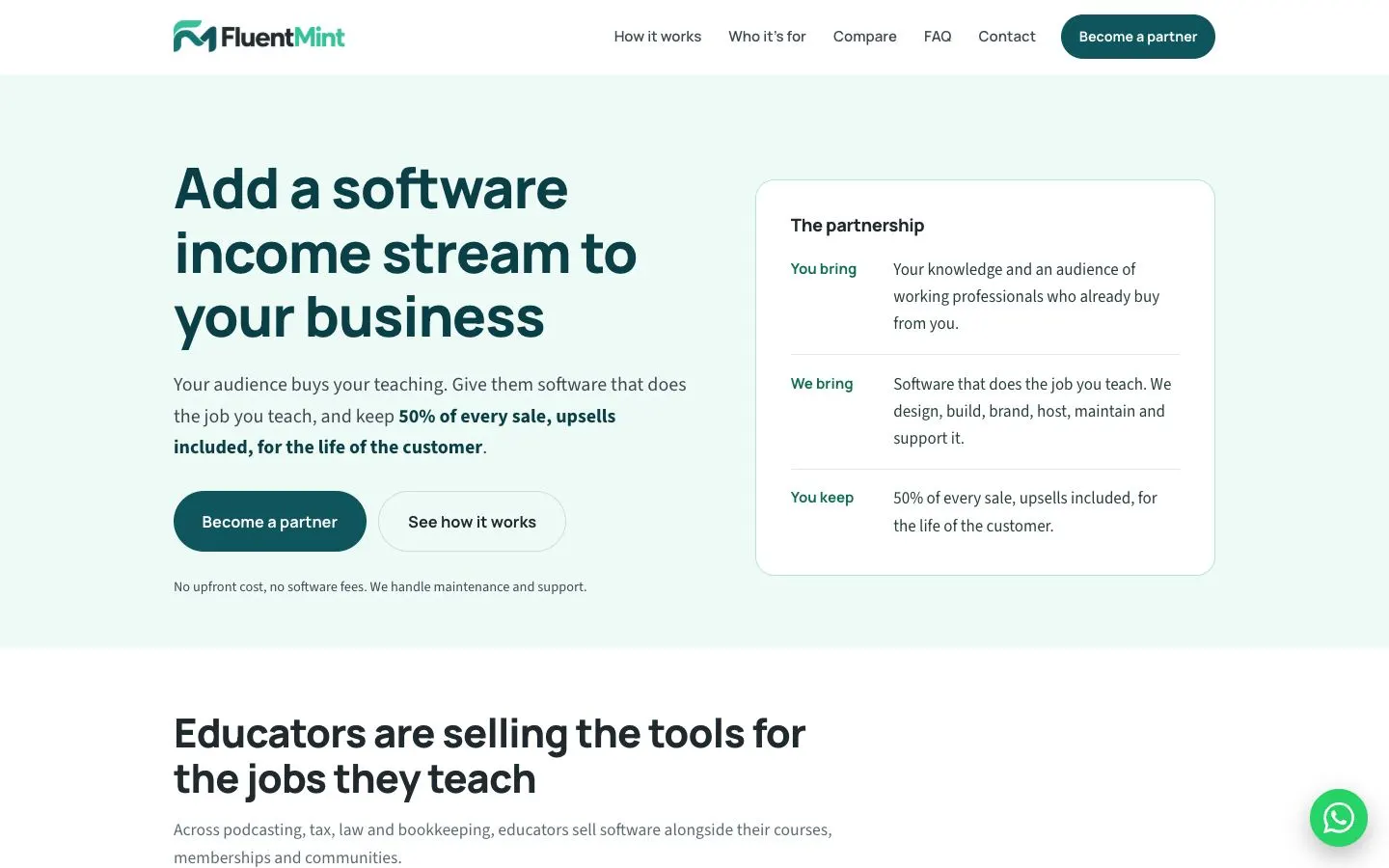
Design decisions
- Hero: a pale mint band with a dark teal (#0B3F47) headline in Manrope and body copy in Source Sans 3 (#3B4A52). The terms of the offer are bolded inside the paragraph, so a quick skim still catches them.
- 'The partnership' card sits beside the headline as a small two-column table: green labels on the left (You bring, We bring, You keep), plain answers on the right, split by hairlines. The whole deal reads at a glance.
- Buttons: a filled teal 'Become a partner' and an outlined 'See how it works', with one small line underneath that answers the cost question before anyone asks it.
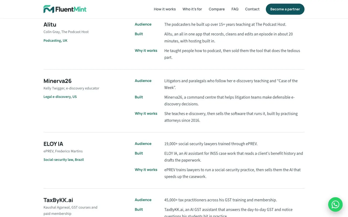
- Examples section: each educator's product is a row with the product name, the person and a green field-and-country tag on the left, and the same labelled lines on the right for every row (Audience, Built, Why it works), so the rows are easy to compare.
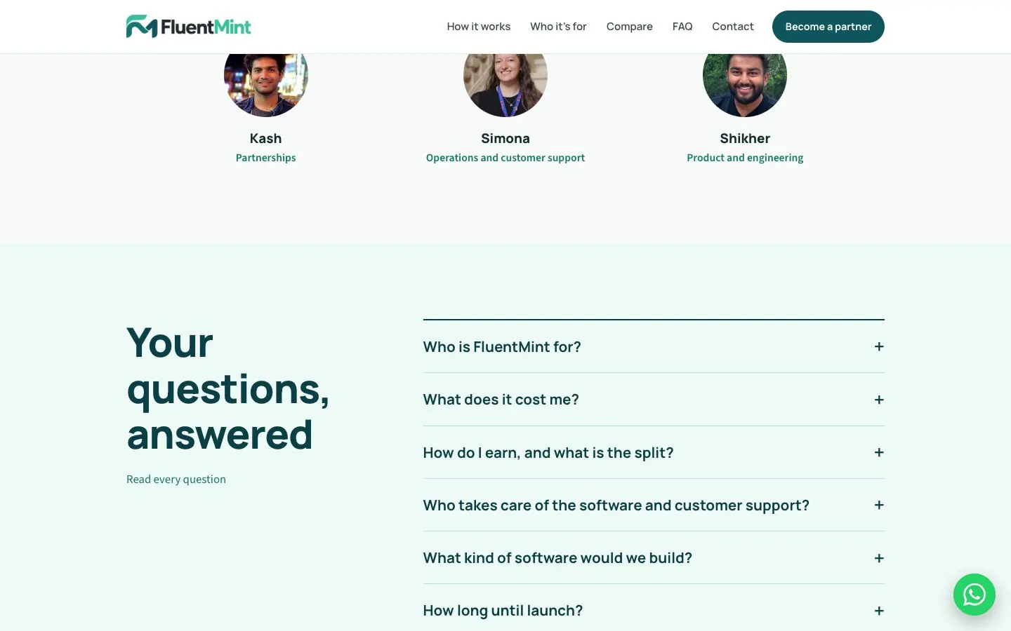
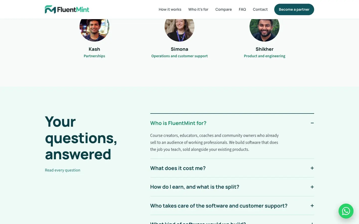
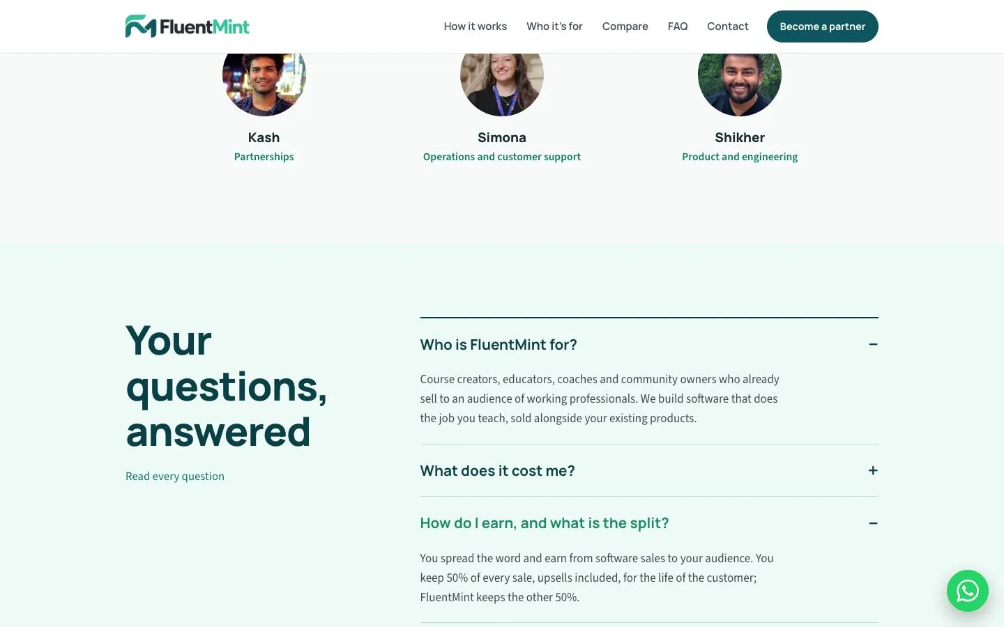
- A team row shows round photos with names and roles in green, placed just before the FAQ.
- FAQ: a large heading on the left and an accordion on the right with plus and minus markers. Several answers can stay open at once, and the question opened last turns green.
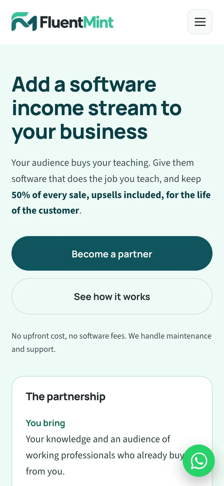
- Mobile: the nav collapses to a menu button, both buttons stack at full width, and the partnership card drops below the copy. A WhatsApp button stays fixed in the corner throughout.
On a phone
FluentMint has a single theme, so there is one set of captures.
The flow, step by step
Further down the page